About Zane Perry's Site
A short summary of the technologies used to build this site and the design choices that guided its look and behavior.
Tech stack
- Next.js (App Router) — Server and client rendering, filesystem-based routing using the
app/directory. - TypeScript — Strong typing for components and data files.
- React — Component-driven UI (server and client components).
- Tailwind CSS — Utility-first styling. The project includes a small set of semantic classes (e.g.
card,section-title) layered on top of Tailwind utilities inapp/globals.css. - Static assets — Images and PDFs live in
public/and employ modern formats (AVIF) for better performance. - Custom components — Reusable pieces live in
components/(NavBar, Footer, PageFade, FadeProvider, etc.).
Design choices
- Minimal, content-first layout — The site emphasizes readability and concise presentation of projects and research.
- Performance-focused — Small images (AVIF), simple markup, and minimal client-side JavaScript where possible to reduce load and improve first-contentful-paint.
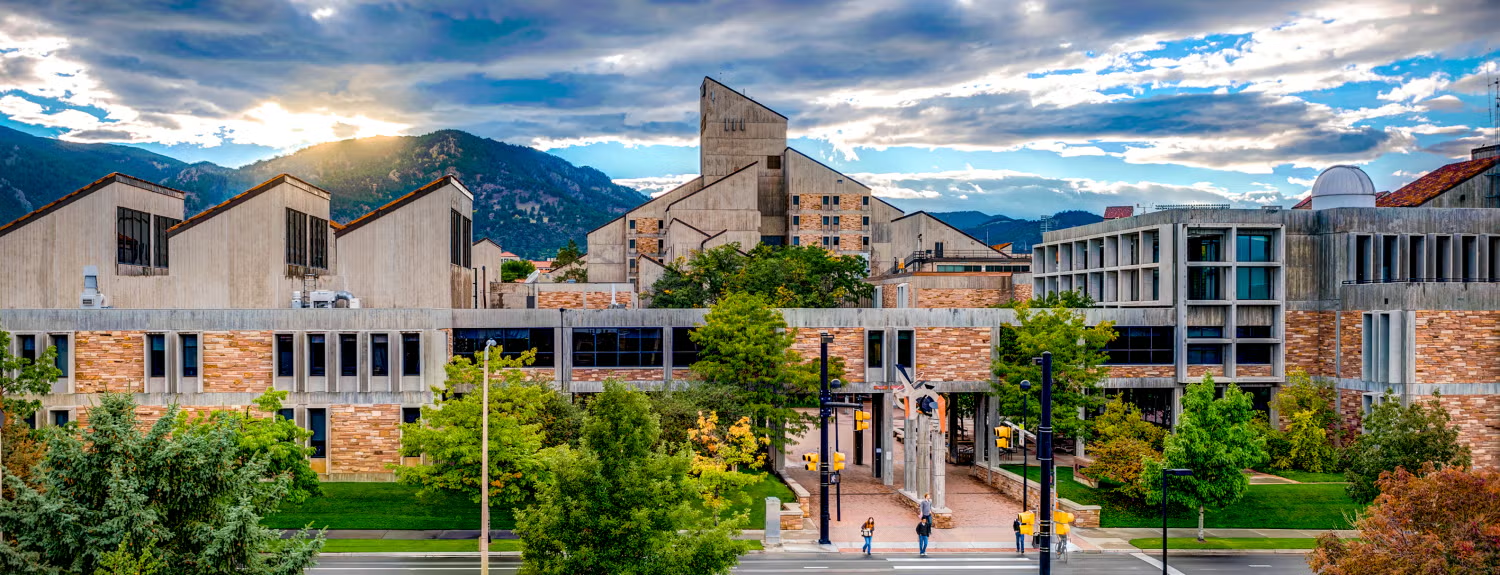
- Subtle motion — Entry/exit fades and a parallax hero are used to make navigation feel smooth while avoiding distraction. The
FadeProviderandPageFadecomponents coordinate these transitions. - Responsive and accessible — The layout uses semantic HTML, responsive utility classes, and accessible attributes (alt text, landmarks). Contrast and font sizes are chosen for readability across devices.
- Color & typography — A restrained palette keeps emphasis on content and imagery; system fonts and a small set of typographic scales are used for consistency.
Source
The repository for this site is available on GitHub:
https://github.com/zane-perry/zane-portfolio
